Concept Art to Final Sprite - Sahi
Hello all! I enjoyed doing Lune's concept art breakdown, so here's one for Sahi.

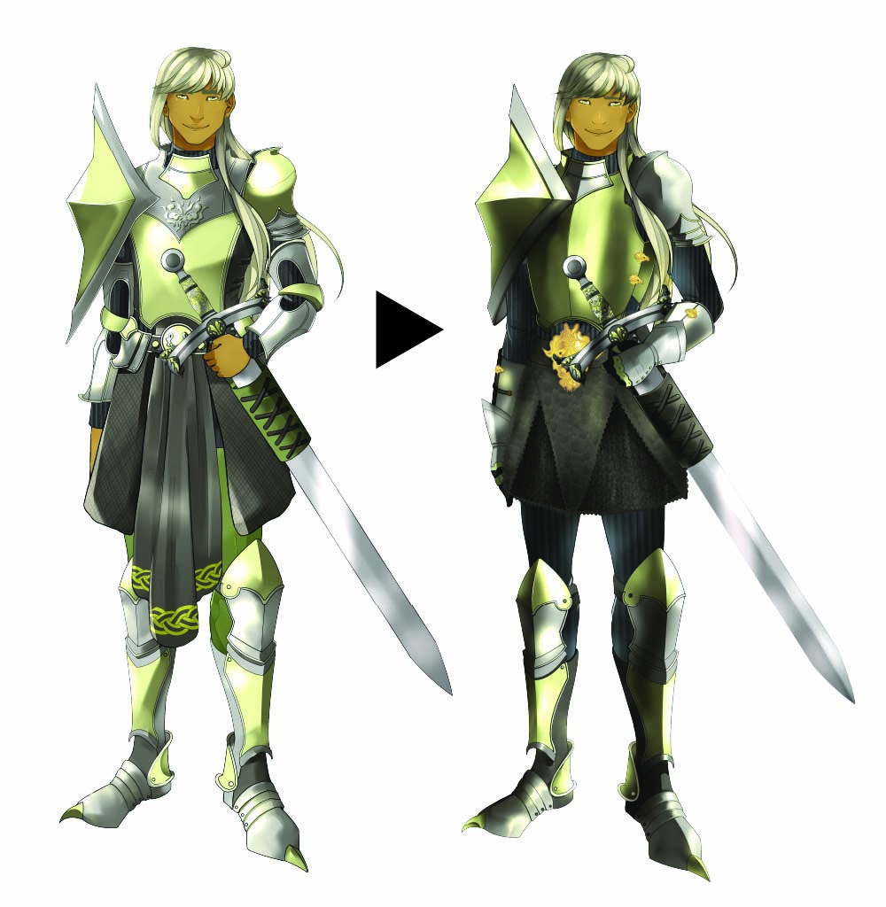
I did not change much in the way of Sahi's base sprite, there were just a few tweaks I needed to make for the character to come out like I intended. I knew right away though that I'd have to adjust his armor. So here's a few flaws I noted when starting the full sprite:
- His head was a smidge too small. I just made it a tad bigger so the proportions looked better.
- His hand was not drawn properly. The hand gripping his sword was a little wonky. It's not too much perfect in the final version, but such is the curse of hands.
- His facial features were slightly lopsided. It's hard to tell, but his nose and mouth weren't exactly where they needed to be.
- The back of his hair was uneven on one side. I centered it so it was more even.
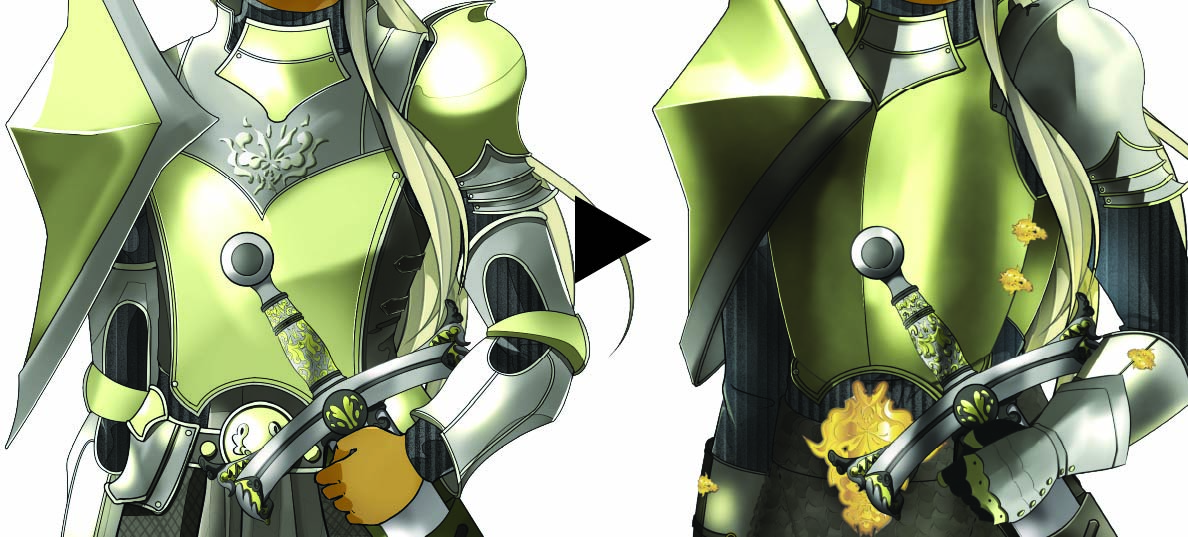
- HIs chest plate was too flat. When I actually started researching armor and how it was put on, I realized that the chest plate should not contour to his body like that, it would be more rounded to avoid...you know, crushing his ribs and things.
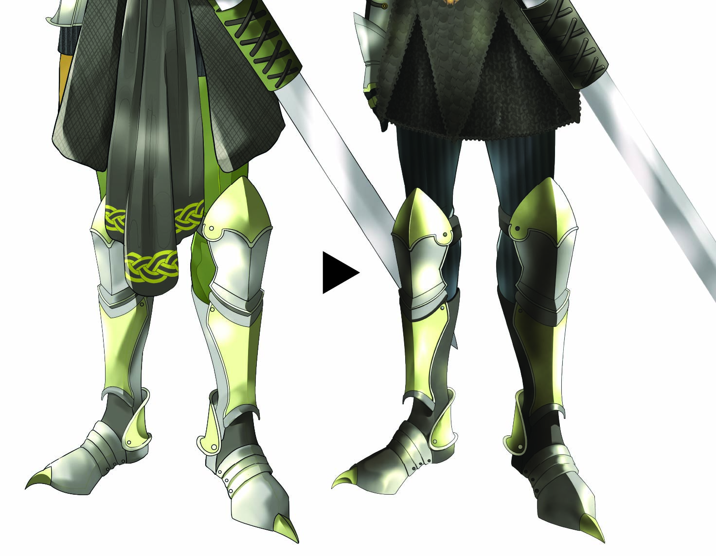
- I wanted him to have a chainmail skirt, but I honestly just got lazy in the first iteration. In the second, I gave him the chainmail I wanted him to have, and got rid of the draping fabric because it seemed impractical for a knight.
- The coloring was too flat. This was a problem all around with the concept art, I feel like the second go round I got a lot more dimension with the characters.
So let's get up close and personal.

Not much changed on the head, just adjusted the hair slightly and contoured his face a bit more with the final coloring style.

This is where the biggest change came in. On the left, you can see the armor is sort of melted do his body. On the right, I took the time to look up how armor fit together and how it was put on, and adjusted accordingly. Of course, I doubt real knights actually wore that huge diamond spike thing he's got on his shoulder, but I'm allowed to take some creative liberties!
The chests-late is in two pieces that buckle together at his sides with the little golden clasps. The two shoulder pads tie on using small bits of string that loop through holes in the shoulders of the chest plate. His arm guards also snap together, and then the gloves just slide on as you'd expect. Same with his skirt.
The clasps and the belt decoration are the official royal crest of Laute, signifying Sahi as working for the royal family.

I adjusted the color of his pants and sheathe because I just wasn't digging the green. Originally I wanted green because his name is derived from the Japanese word "Asahi," which means morning sun (it's also a beer brand I'm pretty sure lol), and it reminded me of fresh vegetation growing. But in the end I decided to go with more neutral colors for his pants and tunic, because I felt that made the armor pop a bit more.
I made the coloring of the armor more dramatic in general, and I'm really happy with how it turned out.
And the toe claws!! I love his little toe claws.
--
And that's it for Sahi from concept to final! Thank you for coming to my Ted talk. I think his outfit is the most complex one I've ever tried to do and I don't think I will ever attempt to draw armor again, realistic or fantasy. But that's okay, because I don't think I could do better than Sahi. ^^
I will likely post a progress update sometime this weekend, so stay tuned! There has been a lot of progress made :)
Get Celestial Crowns
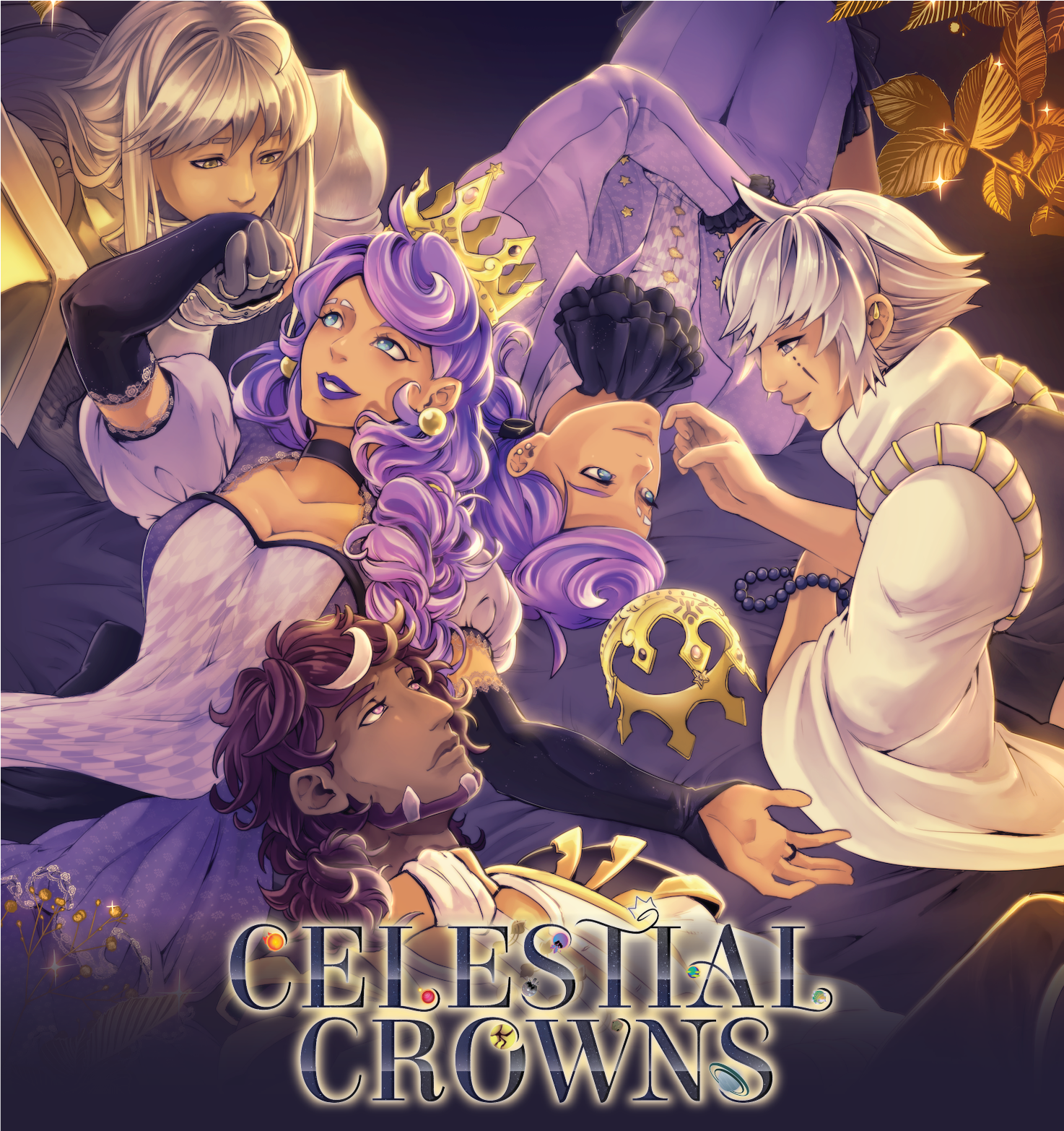
Celestial Crowns
You have the crown. What happens next is up to you!
| Status | In development |
| Author | Harlevin |
| Genre | Visual Novel |
| Tags | Boys' Love, Character Customization, Fantasy, Gay, Kickstarter, LGBT, Meaningful Choices, Otome, Romance |
| Languages | English |
| Accessibility | Subtitles, One button, Blind friendly |
More posts
- October Update - CG Sketches12 days ago
- October Update 202515 days ago
- September Update 202544 days ago
- August Update74 days ago
- Demo Update1.58.788 days ago
- June Update (with music!)Jun 29, 2025
- April UpdateApr 30, 2025
- March UpdateMar 30, 2025
- February UpdateFeb 26, 2025
- January UpdateJan 26, 2025

Leave a comment
Log in with itch.io to leave a comment.