Concept Art to Final Sprite - Lune
I'm thinking of this as a sort of part two to Lune's character intro, I wanted to show a bit of my process with the art, from concept to completion!

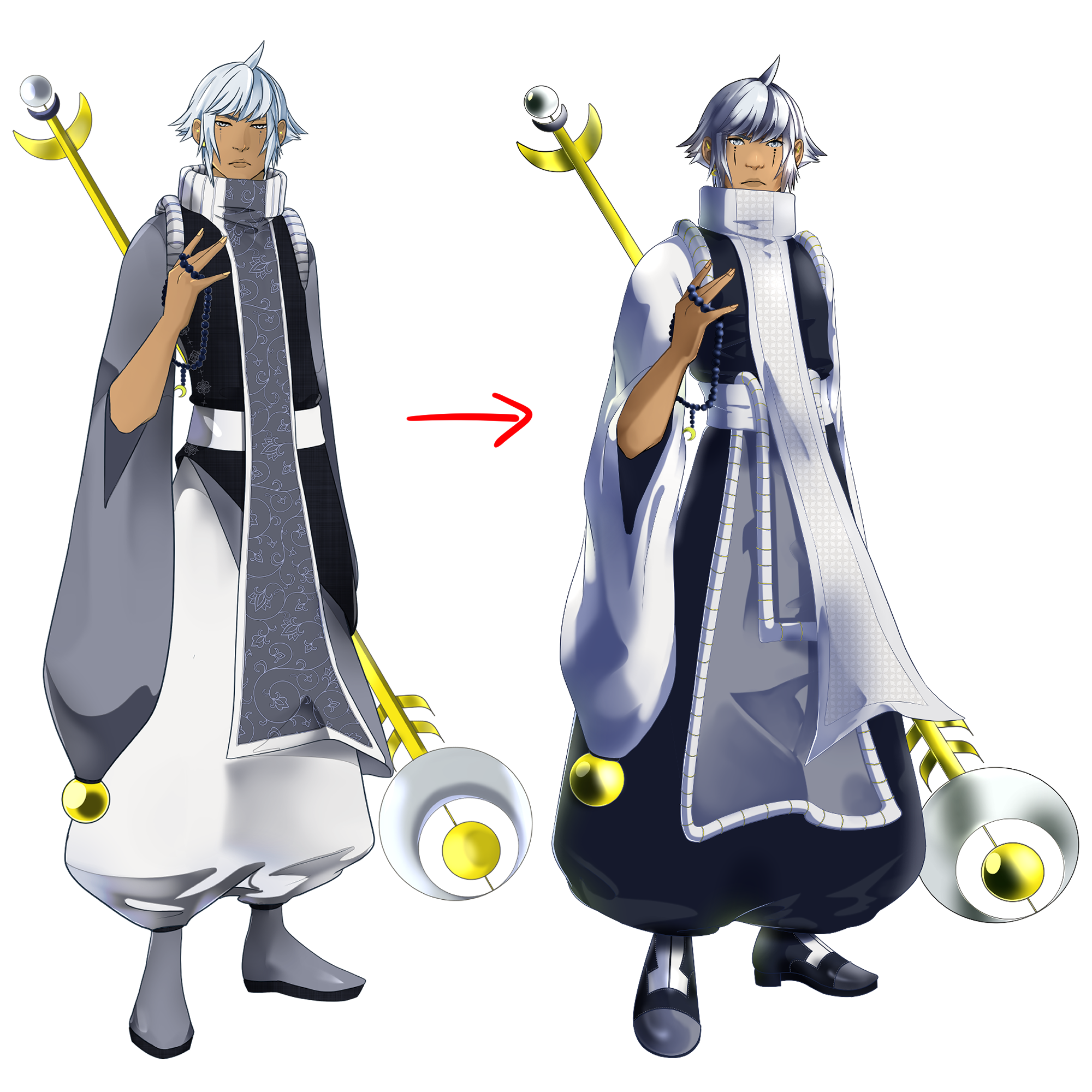
So here we have Lune's concept art on the left, and his completed sprite on the right.
I really liked the overall design, but there were some obvious issues:
- The proportions were off. His body was too long, specifically his torso, and his head was a bit too small in comparison to how I'd drawn the new MC.
- The coloring was flat. Honestly, before this I hadn't drawn consistently for...probably a good few years. I've been pretty dead creatively where art is concerned, so it's been great having something that's been so inspiring. Even still, I just wasn't satisfied with the final look, it wasn't polished enough. Especially his staff, which I think looks much better in the final version.
- The color scheme was a bit too monotone. This wasn't so bad, because he's based on the moon so I was working with cool, gray tones, but I wanted him to pop a bit more.
- His outfit looked flat. I always like drawing outfits with lots of layers, and while he has like two tunic type things in the original, they just looked flat and uninteresting to me. The fabric didn't drape the way it should, either. So I tightened it up by making the top and bottom parts one section, and giving him more layers in the front instead.
I'm not a great artist, but I knew when I finished his concept art that I could do better, and I'm really happy with the result. You probably can't tell, but the lineart is essentially the same. I adjusted the proportions a tad, but like the head, the arm, all the lines are the same as they were in the concept. Yet in the concept it looks like he's looking down, while in the new one he looks more like his head is tilted slightly up (this is helped by the angle of his scarf changing, too). Shading is fascinating! I liked this angle better, since he's a bit taller than the MC (even the male body type) and it mimics their perspective.
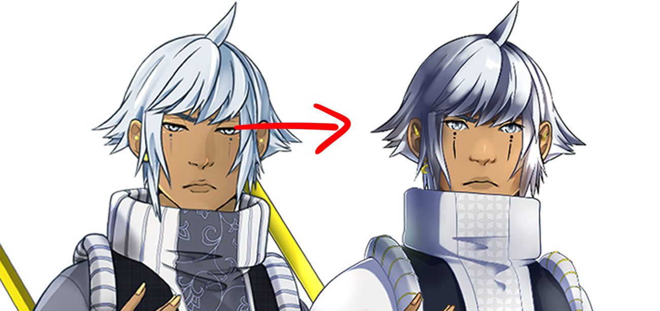
Let's take a closer look.

I made his face tattoos a bit more dramatic and put more time into making the ridges on his sleeve distinct as protrusions instead of just some wonky lines. I changed his earrings a little, making the rook piercing points instead of simple circles. The coloring was made more dramatic overall, but I think it really stands out in his hair in particular.
On all the sprites I removed the lines that represented the top and bottom of the lips and just represented the overall mouth shape with color.
I changed the pattern on his scarf to something more stagnant that I think he'd like better.

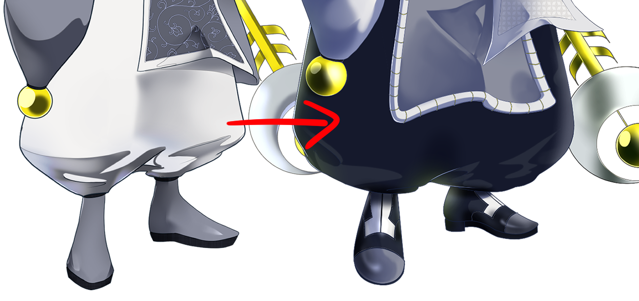
I made his pants FLOOFIER because who doesn't like floofy pants? The shoes also changed because I wanted something a bit more distinct, and I wanted to challenge myself a little with the design. I feel that they're a bit disparaging with the outfit, but they fit Laute's overall style, so I'm happy with them.
Overall, I think Lune's new sprite is a big improvement!
---
Was this interesting? I might do something similar for the MC, but their changes were so much more dramatic, the post might get too long.
Get Celestial Crowns
Celestial Crowns
You have the crown. What happens next is up to you!
| Status | In development |
| Author | Harlevin |
| Genre | Visual Novel |
| Tags | Boys' Love, Character Customization, Fantasy, Gay, Kickstarter, LGBT, Meaningful Choices, Otome, Romance |
| Languages | English |
| Accessibility | Subtitles, One button, Blind friendly |
More posts
- June Update (with music!)1 day ago
- April Update61 days ago
- March Update92 days ago
- February UpdateFeb 26, 2025
- January UpdateJan 26, 2025
- December UpdateDec 31, 2024
- November UpdateNov 30, 2024
- October UpdateOct 23, 2024
- September UpdateSep 24, 2024
- Update 8/6/24Aug 06, 2024

Comments
Log in with itch.io to leave a comment.
I love the floofy rendering!! As someone still getting the hang of digital art, thank you for sharing your learning process <3
I might not write comments often but personally I find it interesting to get a glimpse of the creation process. Maybe even a bit inspiring?
Ohh I actually like the first sprite better just for the face, specially the original eyes. Makes Lune feel older and sharp, like nothing gets past him. The new one is cute, but feels less mature and more child-like adorable.
those eyes are still there! They’re just half lidded, it’s an expression so his new sprite will still have it.
Aww yessss! I'm glad 👌🏻💕